Faire-part de mariage élégants
Six de nos 26 modèles ont été dessinés pour les mariages habillés : sérifs à fort contraste, palettes profondes et sobres, de l’espace à profusion et une enveloppe qui s’ouvre avant que le faire-part n’apparaisse. Créez le vôtre gratuitement, découvrez-le avec vos propres noms et votre lieu, et ne payez qu’à la publication.
Conception et aperçu gratuits. Paiement unique, seulement à la publication.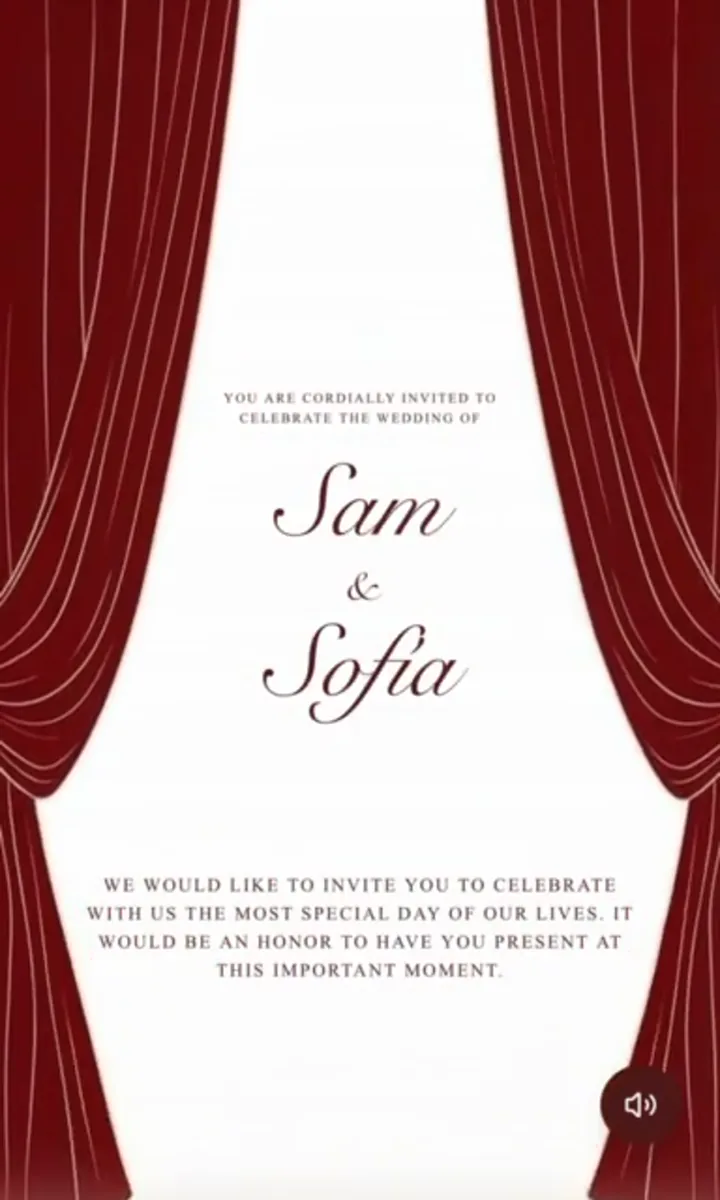


- Teatro
- Heirloom Press
- Swan Lake
Ce qui rend vraiment un faire-part élégant
L’élégance, c’est la soustraction. Presque tous les faire-part qui paraissent chics font quatre choses, et presque tous ceux qui paraissent bon marché font exactement l’inverse.
- La typographie. Un sérif à fort contraste porte les prénoms. Une police d’accompagnement discrète porte la date, le lieu et les informations pratiques. Une écriture manuscrite, si elle apparaît, sert aux prénoms ou à une seule phrase — jamais à un paragraphe, et jamais à côté d’une seconde écriture manuscrite.
- La retenue. Un seul point focal par panneau. Les prénoms sont l’élément le plus grand de l’écran d’ouverture ; tout le reste est plus petit, et la hiérarchie ne vacille jamais. Arabesques, bordures et monogrammes sont des options, pas un moyen de remplir l’espace.
- Les espaces. La papeterie formelle, c’est surtout des marges. Un interlignage qui semble un peu trop aéré à l’écran est généralement juste ; un texte qui frôle le bord est le signe le plus sûr d’une mise en page d’amateur.
- La couleur. Deux couleurs et un métallisé. Encre profonde, violet cathédrale, vert forêt, sang-de-bœuf ou bleu lac sur crème ou ivoire, avec un or ancien qui joue le rôle de la dorure à chaud. Les faire-part de luxe n’utilisent presque jamais une teinte vive ; ils en utilisent une sombre, en petite quantité, entourée de beaucoup de papier.
Rien de tout cela ne dépend du support. Une carte imprimée peut enfreindre les quatre règles, et un faire-part sur téléphone peut toutes les respecter : c’est tout le principe de cette collection.
Formel, tenue de soirée, et comment le faire-part annonce le code vestimentaire
Le texte donne le ton avant même qu’on lise la ligne du code vestimentaire. Les faire-part de mariage formels sont rédigés à la troisième personne, au nom de ceux qui reçoivent, avec la date et l’heure écrites en toutes lettres et rien d’abrégé — pas d’esperluette, pas de chiffres, pas de « bd » pour boulevard. Cette formalité est en soi un message : les invités la lisent et comprennent, avant d’arriver à la dernière ligne, à peu près comment ils seront habillés.
| Registre | Formule d’ouverture | Ligne du code vestimentaire |
|---|---|---|
| Tenue de soirée | ont le plaisir de vous convier | Tenue de soirée exigée |
| Cérémonie religieuse | vous prient de leur faire l’honneur de votre présence | Tenue de cérémonie |
| Formel, à l’invitation du couple | entourés de leurs familles, vous invitent à | Tenue de soirée souhaitée |
| Élégant mais décontracté | seraient ravis de vous compter parmi eux | Tenue de cocktail |
Où qu’il se place, le code vestimentaire a sa propre ligne, en bas à droite, dans le plus petit corps du faire-part. C’est une indication, pas une annonce — et il ne devrait jamais avoir besoin de s’expliquer. Notre guide des textes de faire-part de mariage propose des exemples complets pour parents divorcés, hôtes remariés, secondes noces et mariages bilingues, et le guide pour libeller les enveloppes traite des titres, des accompagnants et des formules correctes pour les couples et les familles.
« Élégant » et « numérique » semblent contradictoires
L’objection est juste, et mérite une réponse honnête. La plupart des faire-part numériques ressemblent à un e-mail, parce que la plupart en sont un : une image en bandeau, un titre dans la police par défaut de l’expéditeur, un bouton coloré. Rien de tout cela n’a l’allure d’un événement.
Trois choses changent la donne. La première, c’est l’ouverture de l’enveloppe — le faire-part s’ouvre avant d’être lu, ce qui crée un instant d’attente plutôt qu’une page simplement posée là. La deuxième, c’est une typographie aux proportions de l’imprimé : de vrais sérifs, une approche de lettres digne de la gravure, et des prénoms à la taille qu’ils auraient sur une carte. La troisième, c’est la texture — les fonds inspirés du papier, derrière le texte, ont la chaleur du papier coton et du gaufrage à sec plutôt que le blanc plat d’une page de navigateur.
Ce que le papier fait encore mieux, c’est le poids dans la main : le moment où l’on ouvre une vraie enveloppe n’est pas entièrement reproductible, et quiconque prétend le contraire cherche à vous vendre quelque chose. Ce que le numérique fait et que le papier ne peut pas faire est tout aussi clair. Les informations restent exactes après l’envoi ; la réponse (RSVP) arrive sans timbre ; le plan d’accès, le programme et les infos pratiques de voyage vivent dans le faire-part au lieu de trois encarts supplémentaires ; et chaque invité peut le lire dans sa propre langue. Beaucoup de couples envoient les deux — une carte imprimée qui garde l’objet cérémoniel, avec tous les détails et la réponse en ligne. Ce compromis est développé dans pourquoi le numérique.
Six modèles élégants, et à qui chacun convient
Voici les designs formels de la collection. Chacun peut être prévisualisé avec vos propres prénoms, votre date et votre lieu avant que vous ne payiez quoi que ce soit.
- Teatro — le plus ouvertement « tenue de soirée » des six. Fond brun profond, or chaud, Playfair Display en grand, et un rideau qui se lève à l’ouverture du faire-part. Idéal pour une réception du soir dans un théâtre, un grand hôtel ou un palais en ville.
- Teatro 2 — le rappel plus sombre et plus orné de Teatro : rideaux de velours cramoisi, lustres dorés et grand escalier aux chandelles, puis des pages acajou au lettrage crème et or. Choisissez-le si vous voulez que votre soirée ait des airs de première à l’opéra.
- Swan Lake — gris-bleu doux et pierre, Cormorant Garamond, une retenue inspirée du ballet. Le registre le plus délicat de cette liste, à choisir pour une cérémonie de jour dans un château, une maison de campagne ou une chapelle où la tenue de soirée paraîtrait trop appuyée.
- Como — bleu lac profond et or ancien, conçu pour les mariages à destination sur les lacs italiens et partout où le décor fait la moitié du faire-part. Il accueille avec élégance un plan d’accès et des infos de voyage, ce qui compte quand la plupart de vos invités prennent l’avion.
- Heirloom Press — le plus traditionnel des six, et la réponse pour qui veut des faire-part intemporels plutôt qu’à la mode. Texture de papier coton, gaufrage à sec, Libre Baskerville, sang-de-bœuf et or ancien, cartons-réponses composés comme une belle papeterie.
- Sacred Union — cérémoniel, en violet profond et or, avec une solennité qui convient à une cérémonie à l’église, à la cathédrale ou au temple suivie d’un dîner assis. Le registre du texte qu’il intègre est le plus traditionnel de tous nos modèles.
Si aucun des six ne vous convient tout à fait, la galerie de modèles complète présente les 26, et chacun peut changer de couleurs.
Rester élégant une fois la personnalisation commencée
C’est là que la plupart des faire-part formels se défont. Le modèle arrive équilibré ; la tentation, c’est d’ajouter. Quatre règles tiennent la ligne.
- Une seule photo, choisie pour sa lumière. Un seul portrait bien exposé, avec de l’espace autour des sujets, s’accorde parfaitement avec une typographie formelle. Un collage, non, pas plus qu’un instantané sur un arrière-plan encombré. L’option la plus traditionnelle est de ne mettre aucune photo sur le panneau d’ouverture — gardez les images pour la partie « notre histoire », plus bas.
- Changez une couleur, pas trois. Si vous remplacez la couleur principale, ne touchez pas à l’accent métallisé. C’est l’or ou le bronze qui donne son luxe à la palette ; remplacez-le par une seconde couleur vive et l’ensemble bascule vers le carton d’anniversaire.
- N’ajoutez pas de troisième police. Deux familles, c’est élégant. L’écriture manuscrite est réservée aux prénoms ou à une ligne, et ce n’est jamais la police d’une adresse.
- Gardez les informations pratiques sobres. Horaires de navette, stationnement et régimes alimentaires doivent être les éléments les moins décorés de la page. La formalité dans le faire-part, la clarté dans la logistique.
Essential (175 €) vous permet de choisir parmi les palettes de couleurs et ajoute le suivi des réponses (RSVP), le tableau de bord des invités, des liens personnels pour chaque invité en 29 langues, le plan de table et le planificateur. La couleur de votre choix, au-delà des palettes, vient avec Premium (395 €), où notre équipe réalise le faire-part pour vous, avec une peinture de votre lieu, votre monogramme et toute la papeterie dans un même design. Starter (49 €) publie le faire-part avec un lien à partager et un QR code. Tous les détails sur la page tarifs.
La conception et l’aperçu ne coûtent rien. Créez le faire-part, mettez-y vos prénoms et votre lieu, regardez-le sur votre téléphone à la taille où vos invités le verront, et décidez ensuite. Commencez ici.
Questions sur les faire-part élégants
Qu’est-ce qui rend un faire-part de mariage élégant ?
La retenue, surtout. Les faire-part de mariage élégants utilisent en général un sérif pour les prénoms, une police d’accompagnement discrète pour les détails, beaucoup d’espace autour de chaque élément et une palette de deux couleurs plus un métallisé. Ce qui donne un air bon marché n’est presque jamais le prix du papier — c’est l’encombrement : trois polices, une photo pleine page derrière le texte et chaque ligne qui réclame la même attention.
Un faire-part de mariage numérique peut-il vraiment être élégant ?
Oui, mais seulement s’il est conçu comme un objet réfléchi et non comme un e-mail. Les modèles Pressed Love s’ouvrent sur une animation d’enveloppe : le faire-part se dévoile au lieu d’être simplement affiché ; la typographie utilise de vrais sérifs aux proportions de l’imprimé ; et les textures inspirées du papier ont la même chaleur qu’un papier coton pressé. Ce qui fait paraître un faire-part numérique bon marché, c’est la même chose que pour un faire-part imprimé — l’encombrement, les ornements standard et une police choisie au hasard.
Quelle est la formulation correcte pour un faire-part de mariage formel ?
La formulation formelle traditionnelle est rédigée à la troisième personne, au nom de ceux qui reçoivent, avec la date et l’heure en toutes lettres et sans abréviation : « Monsieur et Madame James Whitfield ont le plaisir de vous convier au mariage de leur fille Eleanor Rose avec Thomas Bennett, le samedi douze juin deux mille vingt-sept, à quatorze heures trente. » Pour une cérémonie dans un lieu de culte, la formule d’usage est « vous prient de leur faire l’honneur de votre présence ». Notre guide des textes de faire-part de mariage propose des exemples complets pour chaque configuration d’hôtes.
Comment indiquer une tenue de soirée sur un faire-part de mariage ?
Le code vestimentaire figure sur sa propre ligne, en bas à droite du faire-part, dans le plus petit corps de la carte — « Tenue de soirée exigée », « Tenue de soirée souhaitée », « Tenue de cérémonie » ou « Tenue de cocktail ». Ne l’expliquez pas et n’ajoutez pas de point d’exclamation. Si le lieu et le texte sont formels, la ligne du code vestimentaire ne fait que confirmer ce que le faire-part a déjà laissé entendre, et c’est exactement ainsi que cela doit fonctionner.
Quels modèles Pressed Love sont les plus élégants ?
Six de nos 26 modèles ont été conçus pour les mariages habillés : Teatro et Teatro 2 pour les soirées en tenue de soirée, Como pour les mariages à destination en Italie, Swan Lake pour un registre classique et doux, Heirloom Press pour la solennité traditionnelle de la typographie au plomb, et Sacred Union pour les cérémonies religieuses. Chacun peut être prévisualisé en entier, avec vos propres prénoms et informations, avant de vous décider.
Les faire-part de mariage élégants coûtent-ils plus cher ?
Pas chez nous — les modèles formels coûtent exactement le même prix que tous les autres. Pressed Love se règle en un paiement unique : Starter coûte 49 € pour un faire-part publié avec un lien à partager et un QR code, Essential coûte 175 € et ajoute le suivi des réponses (RSVP), le tableau de bord des invités, des liens personnels pour chaque invité, le plan de table et le planificateur, et avec Premium, à 395 €, notre équipe réalise le faire-part pour vous, avec une peinture de votre lieu, votre monogramme et toute la papeterie dans un même design. Ni abonnement, ni frais par invité.
Un faire-part de mariage élégant doit-il comporter une photo ?
Il le peut, mais choisissez une seule photo plutôt qu’une galerie, et choisissez-la pour sa lumière plutôt que pour son émotion. Un seul portrait bien exposé, avec de l’espace autour des sujets, s’accorde parfaitement avec une typographie formelle ; un instantané pris au téléphone sur un fond chargé, non. Les faire-part les plus traditionnels ne portent aucune photo sur le panneau d’ouverture et gardent les images pour la partie « notre histoire », plus bas.
Quelles polices font élégant sur un faire-part de mariage ?
Un sérif à fort contraste pour les prénoms — Playfair Display, Cormorant Garamond et Libre Baskerville sont tous utilisés dans nos modèles formels — associé à une police d’accompagnement sobre pour les informations pratiques. Une écriture manuscrite peut porter les prénoms du couple ou une seule ligne, jamais un paragraphe. Deux familles, c’est élégant ; trois, c’est chargé ; et mélanger deux écritures manuscrites est le moyen le plus rapide de perdre tout l’effet.