
Floral wedding invitations
Botanical line drawings, watercolour blooms, tropical foliage and greenery-only designs — four Pressed Love templates built around plants, and a guide to choosing the one that matches your venue, your season and the flowers your florist will actually be able to buy.
Free to design and preview. Pay once, only when you publish.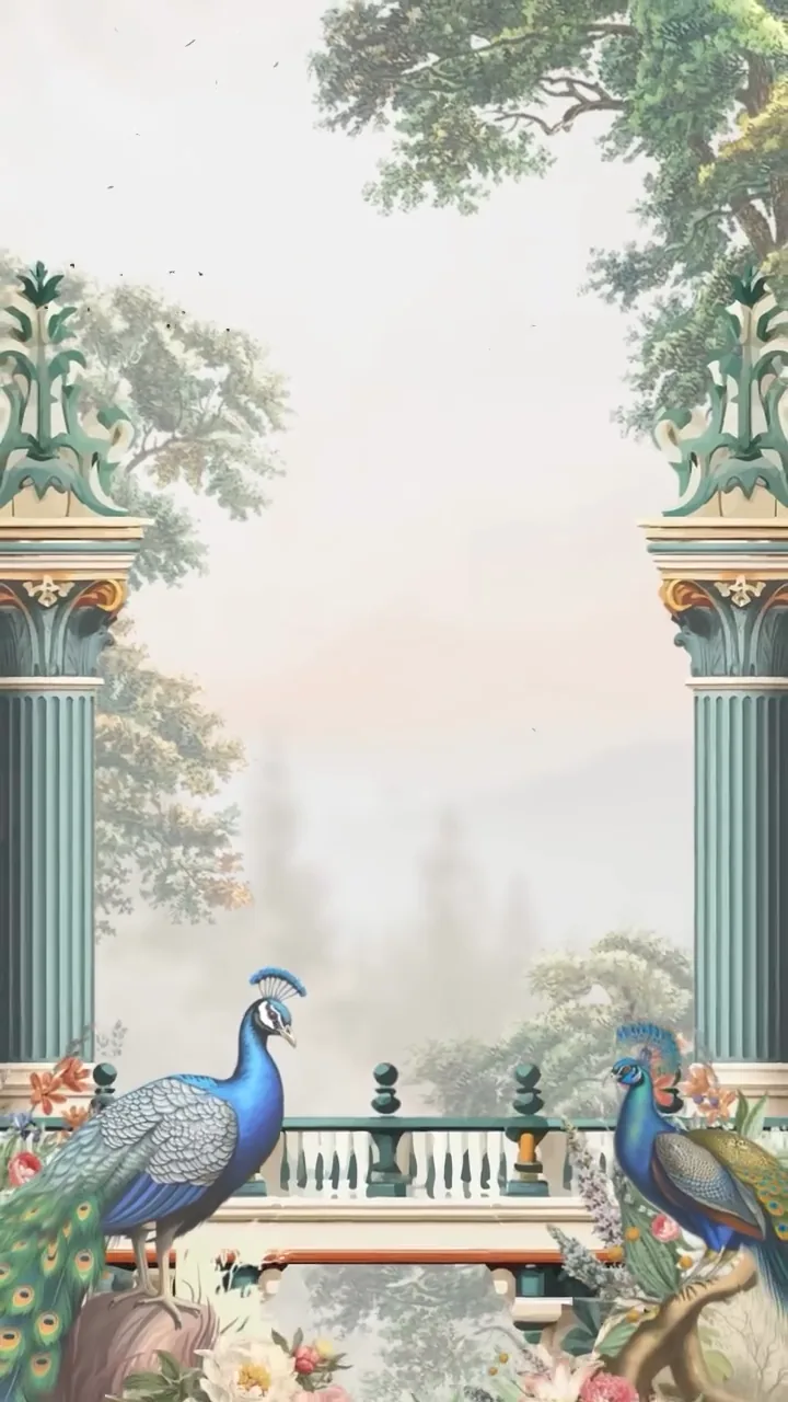
- Garden of Eden
- Floral
- Jungle Butterfly
The five floral families
“Floral” is one word covering five designs with quite different tempers. A couple asking for botanical wedding invitations and a couple asking for tropical ones are not asking for a variation of the same thing. Naming the family first makes everything after it easier — the search, the shortlist, the conversation with your florist.
| Family | What it looks like | Suits |
|---|---|---|
| Botanical line drawing | Fine ink outlines, stems and leaves, flat or unfilled | Modern, restrained, city weddings |
| Watercolour floral | Soft washed blooms, bleeding edges, no hard outline | Spring and summer garden ceremonies |
| Pressed flower | Flattened, dried specimens; handmade and slightly imperfect | Small, sentimental, keepsake-minded weddings |
| Tropical | Palm, monstera, protea; saturated colour | Island, jungle and beach destinations |
| Greenery only | Eucalyptus, olive, fern — foliage without blooms | Vineyards, olive groves, autumn, neutral palettes |
They are not equally formal. Line drawing and greenery survive a black-tie dress code; watercolour sits in the warm middle where most garden weddings live; tropical is the loudest and asks the rest of the day to be similarly confident.
Match the invitation to your venue and season, not your mood board
An invitation is the first picture your guests have of the day. If it shows a jungle and they arrive at a stone barn in Yorkshire, nothing is ruined — but a small piece of coherence has been spent for no reason. Three checks prevent it, and none of them take long.
- What the venue already gives you. An olive grove, a walled garden or a lakeside terrace is doing floral work before a single stem is bought. Invitations for those venues can afford to be quieter — greenery, or a single drawn stem — because the setting supplies the rest.
- What is genuinely in season. Peonies in October are either imported at a price or not happening. Choosing an invitation around a flower that will not be there in the photographs is a strange way to start.
- What your florist is planning. One email — “what do you expect to be using that week, and in what colours?” — settles the palette question before you commit to a design.
The mistake worth naming is trying to reproduce your bouquet exactly. Your florist buys what is good on the day, so the arrangement agreed in October may quietly change by June. Match the family and the two dominant colours and the substitution is invisible; insist on the specific stems and you have made a promise the flower market will break for you.
A seasonal guide, month by month
A Northern-hemisphere guide, and a generous one — growers, tunnels and local climate shift the edges. Treat it as a shortlist for your florist, not a rule.
| Months | Typically available | Palette that follows |
|---|---|---|
| January – February | Hellebore, anemone, ranunculus, narcissus | White, ink, deep green, a little burgundy |
| March – April | Tulip, blossom, lilac, sweet pea, narcissus | Pale pink, butter yellow, fresh green |
| May – June | Peony, garden rose, lily of the valley, foxglove | Blush, cream, soft coral, sage |
| July – August | Dahlia, cosmos, delphinium, hydrangea, sunflower | Cornflower blue, terracotta, saturated brights |
| September – October | Dahlia, chrysanthemum, amaranthus, berried branches | Rust, plum, bronze, deep red |
| November – December | Amaryllis, anemone, evergreen, eucalyptus | Silver-green, white, ink, burgundy |
Palettes that survive a phone screen
A digital invitation is read on a phone, often outdoors and one-handed. That imposes one rule the printed world does not: text must stay legible over the florals. Dense blooms behind the ceremony time is the most common reason a beautiful invitation becomes an irritating one.
Three colours is usually the ceiling — a dominant, a support and an accent. Blush with sage and cream is the safest romantic combination and the reason it appears everywhere. Ivory with olive and a single ink tone is the greenery-only version, and it holds up in every season. Rust with plum and bronze is autumn without costume. Tropical palettes break the three-colour rule deliberately, which works when the foliage does the shouting and the typography stays plain.
Choosing between the four floral templates
Four Pressed Love templates are built around plants, and between them they cover the families above — so this is a choice of wedding, not of decoration.
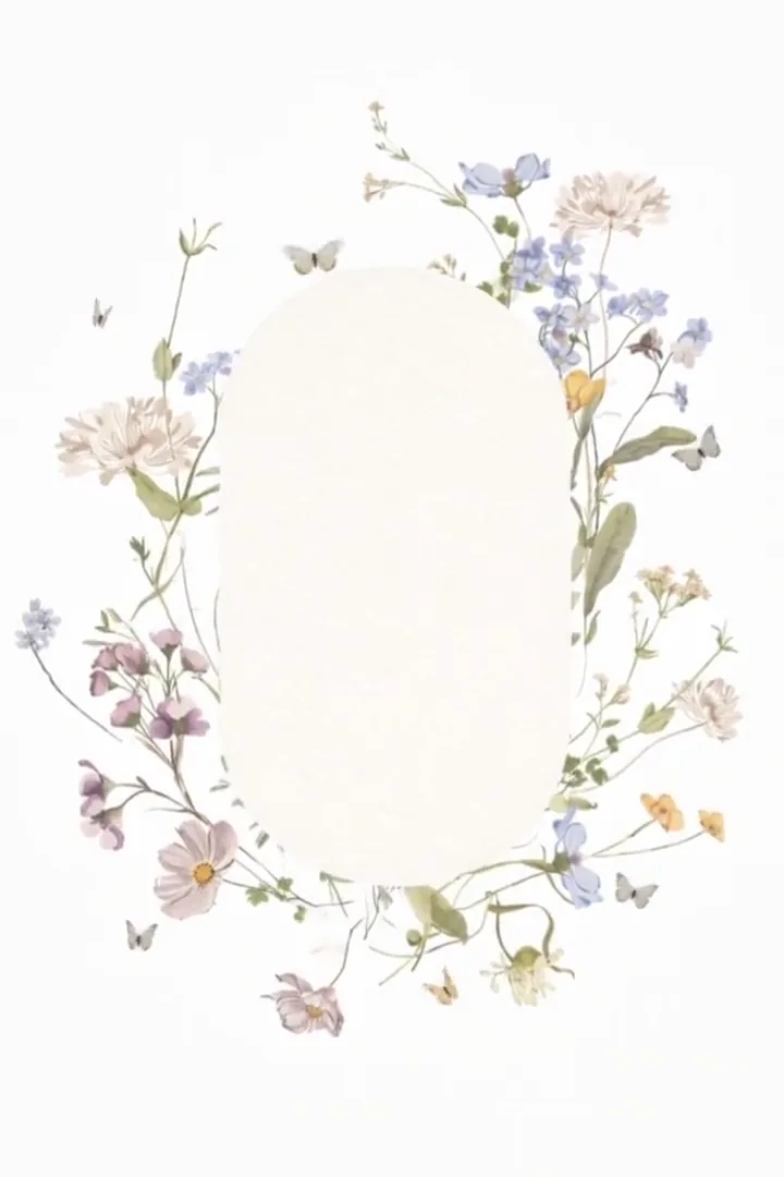
- Floral — the most versatile of the four. Soft pinks, creams and sage, romantic without maximalism. This is the watercolour-adjacent default for a spring or summer garden ceremony, and the right starting point if you know you want florals but have not settled on how much.
- Temple Garden — sage, oat, eucalyptus and soft pink, with a quiet ceremonial feel. The closest thing to a greenery-only invitation in the collection, and the one to pick for a botanical venue, a brunch wedding, or any day where the setting is already green enough to lead.
- Garden of Eden — deep emerald and gold, with peacocks, peonies and sage-green columns. The botanical-illustration option: denser, warmer and more abundant than Floral. Built for late-spring weddings and for couples whose flowers are the point rather than the frame.
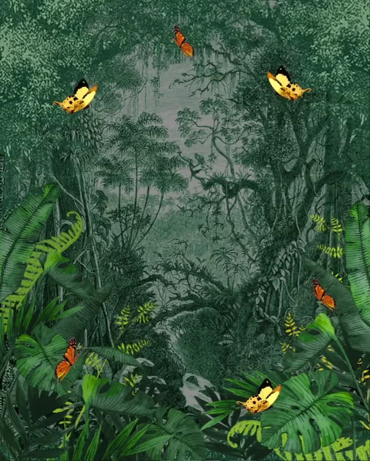
- Jungle Butterfly — hand-drawn butterflies and tropical foliage in a vibrant palette. The tropical wedding invitation of the set, made for destination weddings in jungle or island settings and for couples who want colour rather than restraint.
If none of the four is quite it, Love Harmony sits just outside the collection: a misty painted landscape of peaks, pines and a waterfall, with dusty-rose lettering on ivory — a modern-romantic middle ground worth a look. The full template gallery shows every design side by side, and all of them are free to build and preview.
When floral is the wrong choice
It is worth saying plainly, because a floral invitation on the wrong wedding looks like a decision nobody made.
- A black-tie evening in a city. Florals soften; formal evening weddings usually want the opposite. Teatro and Afterglow are built for that register.
- A venue that is the story. If you are marrying in a villa, a castle or somewhere guests will travel for, a photograph of the actual place beats an illustration of flowers. The Venue and Como are made on that logic.
- A deliberately spare aesthetic. Couples who have chosen candles, linen and no arrangements at all should not open with peonies. Greenery or a plain typographic design tells the truth about the day.
- A stationery-led, heirloom feel. Heirloom Press carries the letterpress texture that many people are actually reaching for when they say “pressed flower wedding invitations”.
About the name
Pressed Love is named after pressed flowers — the old habit of flattening a bloom between the pages of a book so a day survives in a form you can keep. That is the feeling the whole product is aimed at, so this collection is about as on-brand as a page here gets. To be accurate about the detail: these templates are illustrated and photographic rather than literal scans of dried specimens, and a digital invitation is a link, not an object in a drawer. What it keeps instead is everything a card cannot — the schedule, the map, the music, the photographs — at one address that stays correct when a detail changes.
Wording, and what it costs
The design sets the tone; the words still have to do the work. If you are unsure how formal to be, the wedding invitation wording guide has examples from fully traditional to entirely relaxed, and every one of them sits comfortably on a floral template.
Pressed Love is a one-time payment, never a subscription. Starter (€49) publishes the invitation with a shareable link and a QR code. Essential (€175) adds RSVP tracking, the guest dashboard, per-guest WhatsApp, SMS and email links, and 29 languages. It also includes the colour palettes, the seating chart and the planner. Premium (€395) is made for you by our team, with a painting of your venue, your monogram and the whole suite in one design. Designing and previewing cost nothing at all — build the whole thing, look at it on your own phone, and pay only when you publish. Start at /create.
Questions about floral invitations
What counts as a floral wedding invitation?
Any invitation whose main decorative language is plants — blooms, stems, leaves or fruit. In practice the term covers five quite different looks: botanical line drawings, watercolour florals, pressed flower designs, tropical foliage, and greenery-only invitations with no blooms at all. They read very differently to a guest, so it is worth deciding which family you mean before you start browsing.
Should my invitation flowers match my actual wedding flowers?
Match the family and the palette, not the individual stems. Your florist buys what is good that week, so a bouquet promised in October can change by June. If your invitation says soft blush garden roses and the day delivers soft blush garden-style blooms of some kind, nobody will notice the substitution. If your invitation says bold tropical palms and the day is an olive grove, the mismatch is visible in every photograph that shows both.
What is the difference between botanical, watercolour and pressed flower invitations?
Botanical means fine outlines — an ink drawing of a stem, often unfilled or filled with one flat tint. It reads modern and restrained. Watercolour means soft washed blooms with bleeding edges and no hard outline; it reads romantic and slightly informal. Pressed flower refers to the look of a real flower flattened and dried, which reads handmade, sentimental and a little imperfect. All three can carry exactly the same wording; they simply set a different expectation about the day.
Which flowers are in season for my wedding month?
Broadly, for a Northern-hemisphere wedding: hellebore, anemone and ranunculus in January and February; tulip, blossom, lilac and sweet pea in March and April; peony, garden rose and foxglove in May and June; dahlia, cosmos, hydrangea and delphinium in July and August; dahlia, chrysanthemum, amaranthus and berried branches in September and October; amaryllis, anemone, evergreen and eucalyptus in November and December. Southern-hemisphere and tropical weddings run on a different calendar entirely — ask your florist rather than following a European seasonal chart.
Are floral wedding invitations too traditional?
Only if you choose a traditional treatment. A dense watercolour border does read classic and romantic. A single line-drawn stem on an otherwise plain page reads contemporary, and a greenery-only design in eucalyptus and olive reads neutral enough that couples who dislike the word "floral" often choose it happily. The style band is wide — the objection is usually to one end of it.
Do you have tropical wedding invitations for a destination wedding?
Yes — Jungle Butterfly is the tropical option, built around hand-drawn butterflies and tropical foliage in a vibrant palette, and designed for weddings in jungle, island or heavily planted destination settings. If your destination is Mediterranean rather than tropical, the greenery-leaning Temple Garden usually sits closer to what guests will actually see when they arrive.
Can I change the colours of a floral template?
Every template ships with its own considered palette, and you can swap the photographs, wording and schedule on any plan. Essential (€175) adds a choice of colour palettes for the whole invitation, and Premium (€395) any colour you like. Designing and previewing are free on every plan, so you can build the invitation, look at it properly on a phone, and only pay when you decide to publish.
Does a greenery-only invitation still count as floral?
For searching purposes, yes — greenery wedding invitations sit inside the same family and suit the same venues. What changes is the temperature. Eucalyptus, olive and fern give you the garden-wedding signal without pink, which is why greenery is the usual choice for couples who want a botanical invitation that reads gender-neutral, and for autumn weddings where blooms would look out of step with the season.